HOW TO USE THE SITE
- Overview – The dashboard identifies probable price levels of resistance/support via analysis of the open stock option positions in the market. In addition to price levels, the dashboard provides insights into the liquidity level of the market, option expiry concentrations, and much more. Our dashboard allows the user to interact with the charts for 100+ stock tickers. All of this provided at an affordable price (Free) for the retail trader.
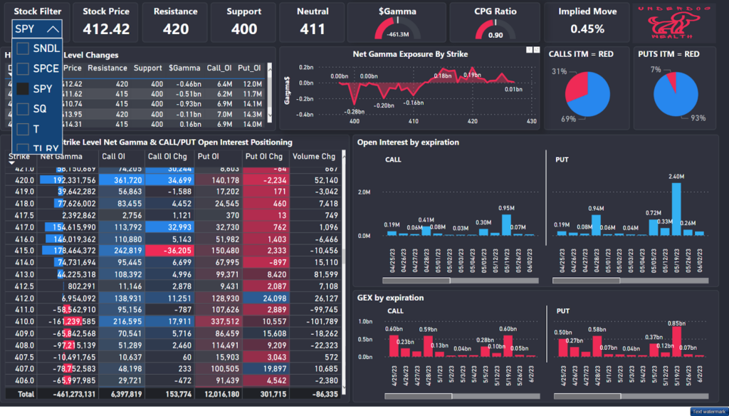
- Top row cards – Top row cards call out the key metrics a trader should know for the day:
- Stock Filter – Choose Any of our 100 tickers we follow to see that specific Stock’s Option Structuring.
- Resistance – We don’t expect price to exceed higher than this point. Often can be a magnet for price. The resistance level identifies the largest positive net gamma exposure level for the stock.
- Support – We don’t expect price to exceed lower than this point. The support level identifies the largest negative net gamma exposure level for the stock.
- Neutral – Where the dealers’ net gamma exposure is zero. Often a point of mild resistance/support for price.
- Gamma Dollars – Total net gamma exposure. Large negative number = illiquid market (large volatile moves possible) while large positive number = very liquid (mean reversion & tight moves)
- CPG Ratio – Call/Put Gamma weighted Ratio. Ratio of currently active Call Option gamma exposure to currently active Put Option exposure. If this is relatively high/low it can indicate short term reversals.
- Implied Move – Options price Implied 1 day move. Using the 0DTE at-the-money (ATM) option price we calculate the price’s 1 day implied move for the underlying stock.


- Middle row charts
- History of Key Levels + Call/Put Open Interest (OI). Use this table to see if resistance/support levels have been increasing/decreasing in the past few days to identify new trends.

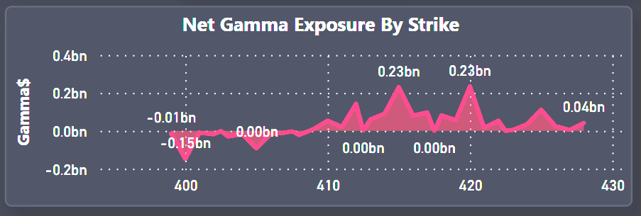
- Visual of Strike level net gamma exposure to visually see Resistance/Support levels. While the top row cards provide the largest resistance/support levels, there can be smaller price pockets of resistance/support. Use this graph to visually see the +Gamma Resistance levels and -Gamma Support levels across strike prices.
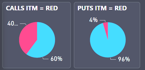
- What % of Calls/Puts are In The Money (ITM). E.g. If a large amount of Calls are ITM one should monitor for Call owners to potentially monetize gains if price action continues higher or be aware of when these call positions may be expiring which would potentially lead for a reversal.
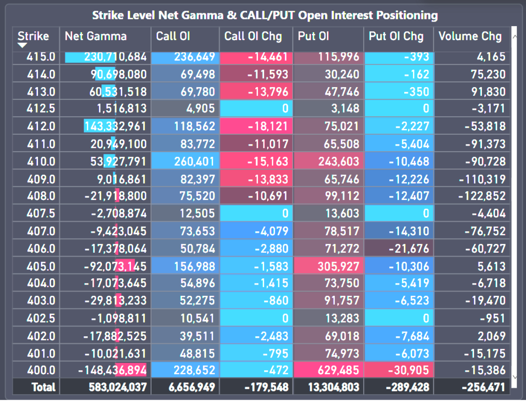
- Main strike level granularity table – This is the most useful table of the whole dashboard. This shows all strike levels’ net gamma exposure, Call/PUT OI and OI daily changes. Net gamma exposure at strike level shows resistance/support levels, pockets of liquidity/illiquidity (e.g. Positive/Negative gamma) and how Open Interest is changing at the strike level for Calls/Puts to provide a glimpse into market sentiment.
- OI Expiry breakout
Open interest expiry breakout shows when current options are expiring. This information is particularly useful to know when current Resistance/Support levels may expire or when Options decay will begin to pick up. Another key feature of the dashboard is the ability to click on a specific expiration date on the chart (e.g. Today’s 0 days to expiration date) and see all the other charts update to provide that expiry’s positioning.
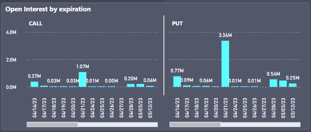
- GEX expiry breakout

Net Gamma Exposure expiry breakout shows when current options are expiring. This is information is particularly useful to know when current Resistance/Support levels may expire or when Options decay will begin to pick up. Another key feature of the dashboard is the ability to click on a specific expiration date on the chart (e.g. Today’s 0 days to expiration date) and see all the other charts update to provide that expiry’s positioning.